Feed My People — 40th Anniversary Branding
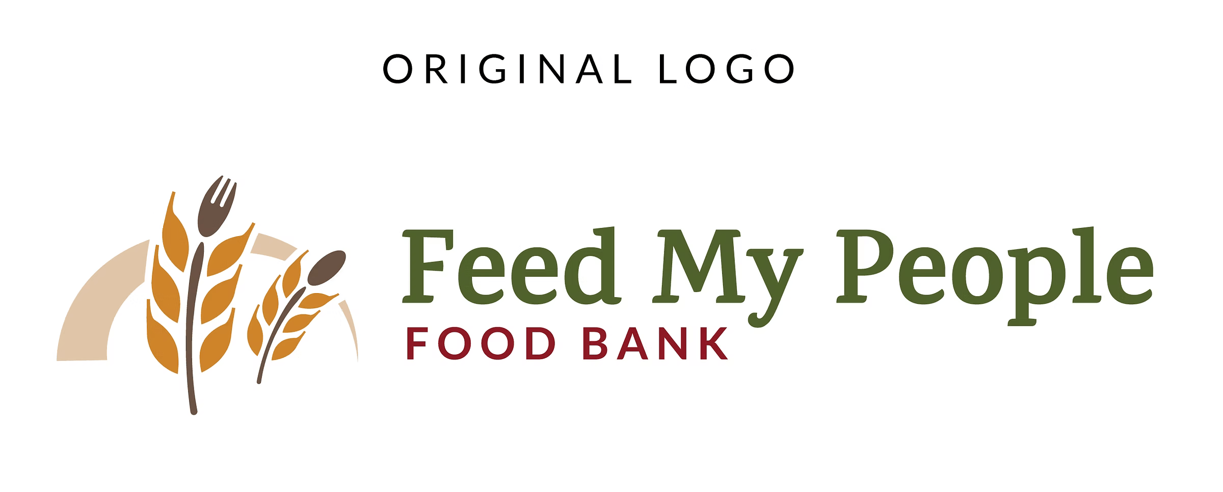
The local nonprofit Feed My People commissioned a special 40th anniversary logo to celebrate four decades of service. The design was created as an extension of their existing visual identity, retaining the recognizable wheat imagery and overall character of the original logo while introducing a bold, commemorative treatment. Ruby red was selected as the primary color, reflecting the traditional color associated with 40th anniversaries.

Extending an Existing Identity
I developed several concepts for the client, who gravitated toward this modern, negative-space direction. The final design integrates the existing wheat imagery into a large “40,” while “YEARS” is incorporated into the lower portion of the mark using negative space. The result created a distinct anniversary identity that could be used throughout the year while remaining immediately recognizable as Feed My People.