Music Festival Merchandise Collections

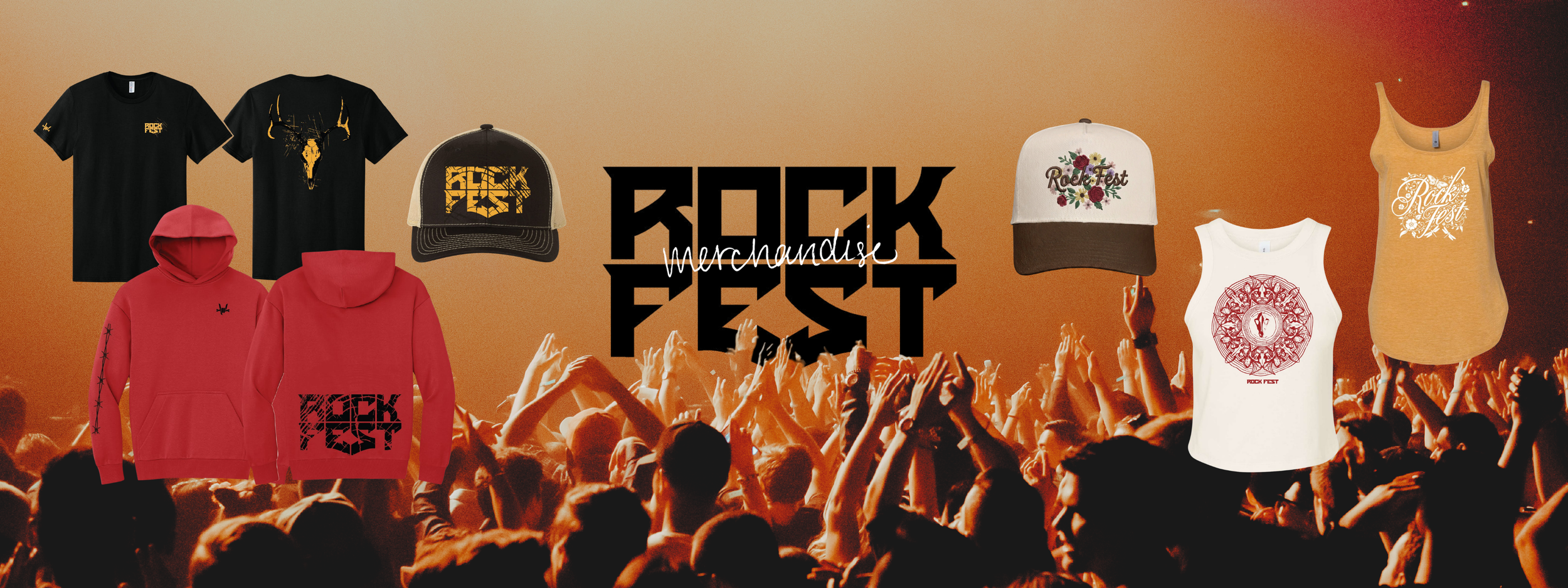
As the in-house designer for King Apparel, I created apparel collections for three Wisconsin music festivals, designing merchandise across multiple garment types while balancing each festival's unique identity, current apparel trends, and production requirements. My work spanned concept development, garment selection, production-ready artwork, client approvals, and print preparation.

Rock Fest
Festival Merchandise Collection
Largest rock + camping event in the U.S.
360-acre venue
80+ bands
5 stages
7,500 campsites
Independently run festival
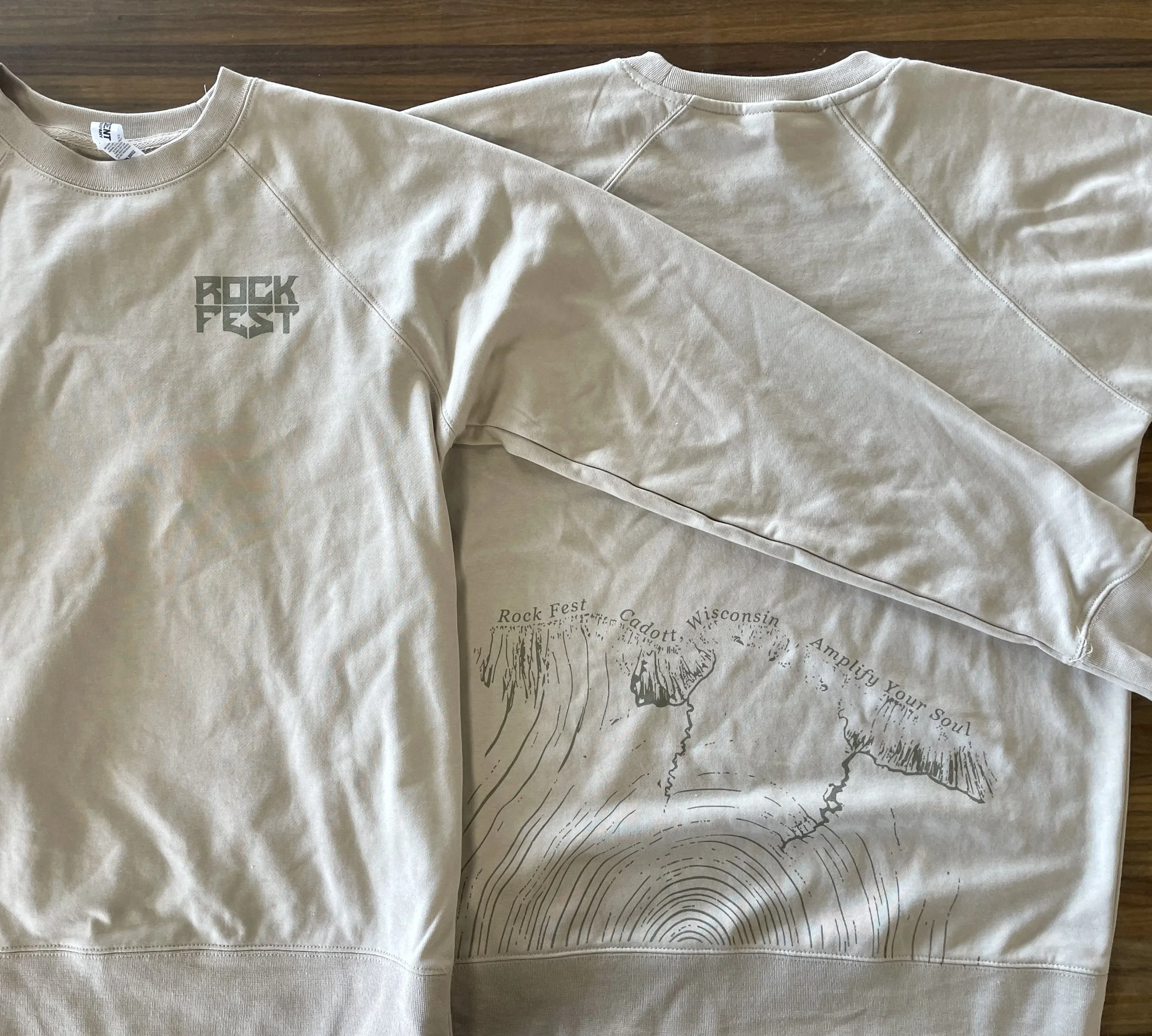
For this duo design, I wanted to branch out (pun intended) from the more rigid, traditional rock aesthetic of the overall branding and instead focus on the organic tree ring motif. For apparel, I decided on a lightweight long-sleeve crewneck, great for Wisconsin summer nights, in earthy olive green and cream. I wanted to explore different and surprising placements for artwork, and in this instance have the nature “growing” from below.
Pictured: The design process from brand guide elements, to digital mockups, to the final printed garment.
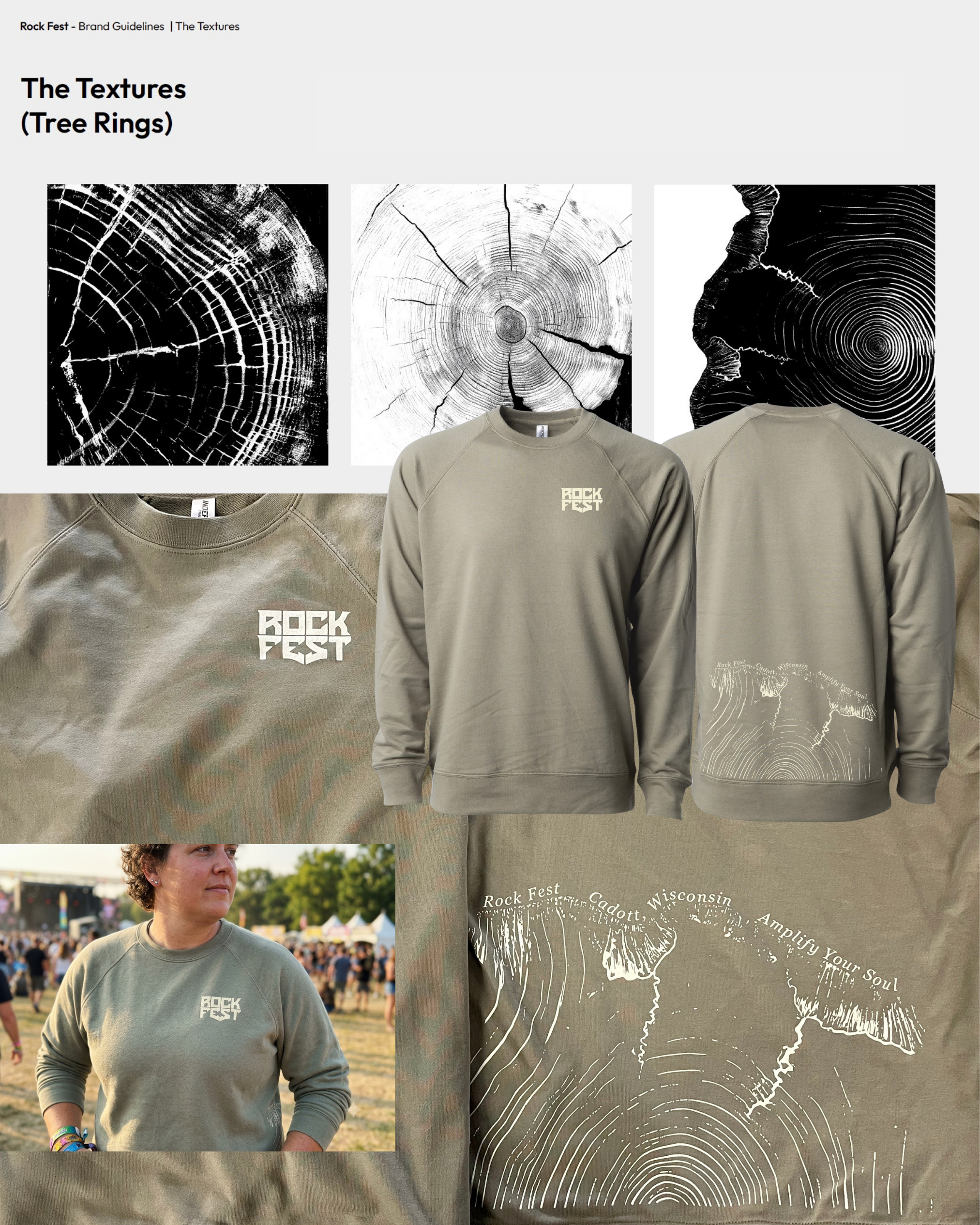
Specialty placement sweatshirt using a subtle front logo and oversized lower-back illustration inspired by the festival’s rural Wisconsin setting.

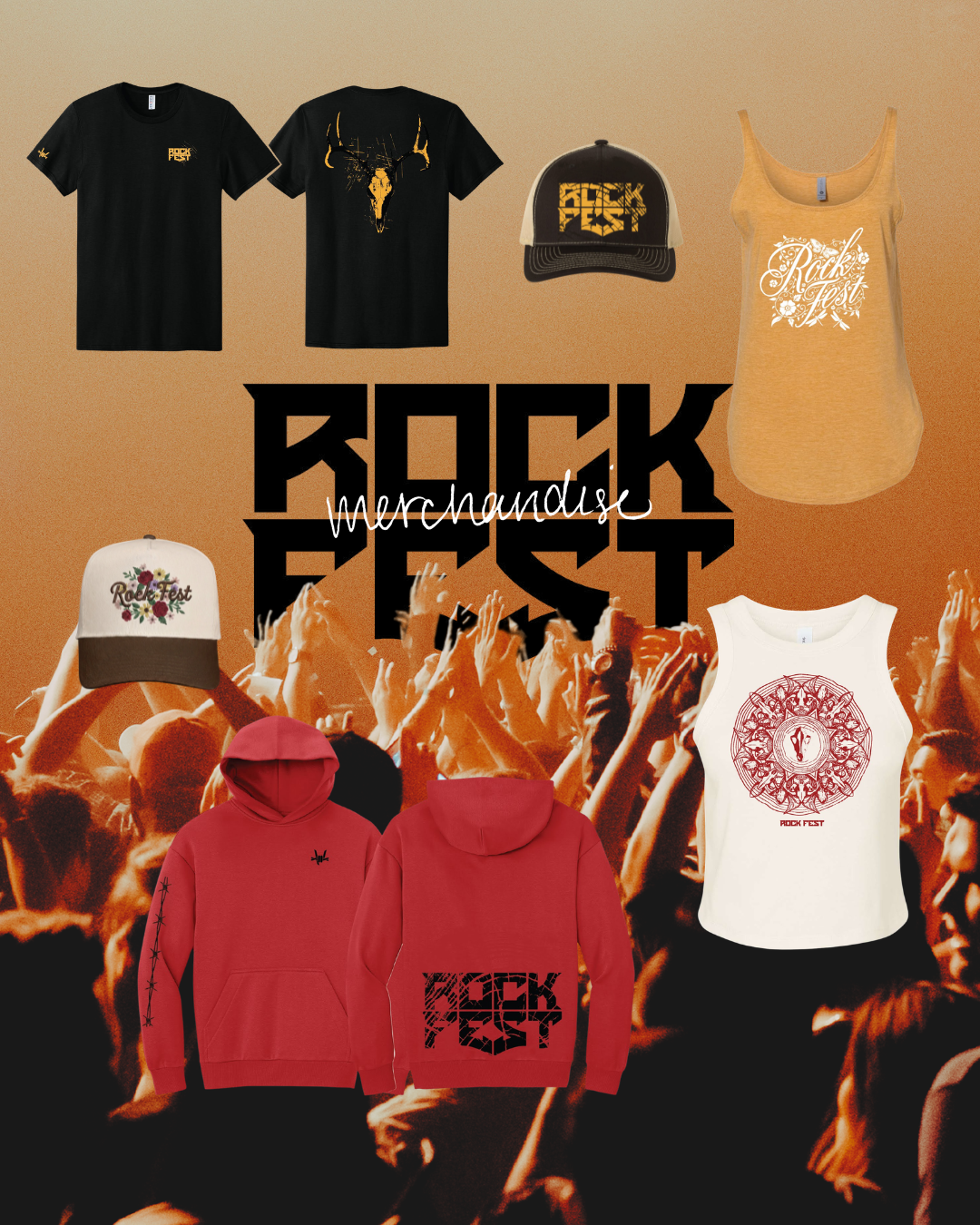
Illustrated Graphics
Created detailed statement graphics designed to translate across multiple silhouettes and print sizes.
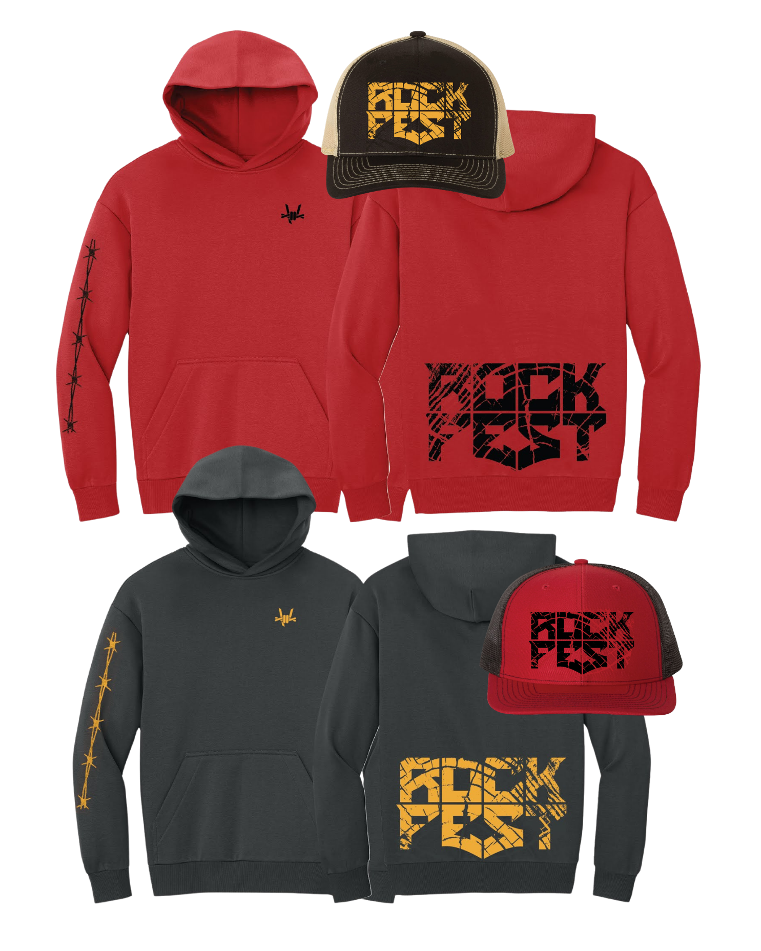
Distressed Logo System
Built a high-impact logo system using distressed textures, sleeve placements, and bold colorways.
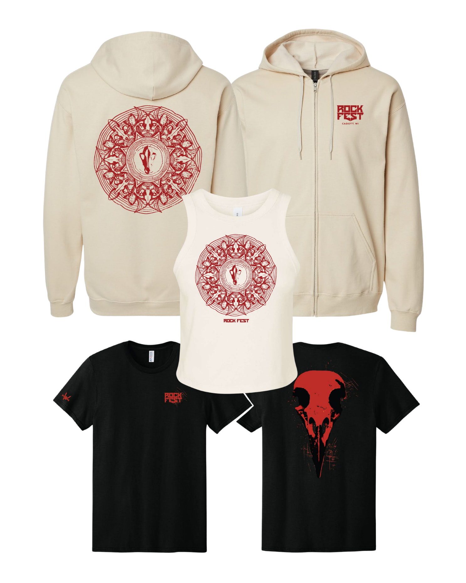
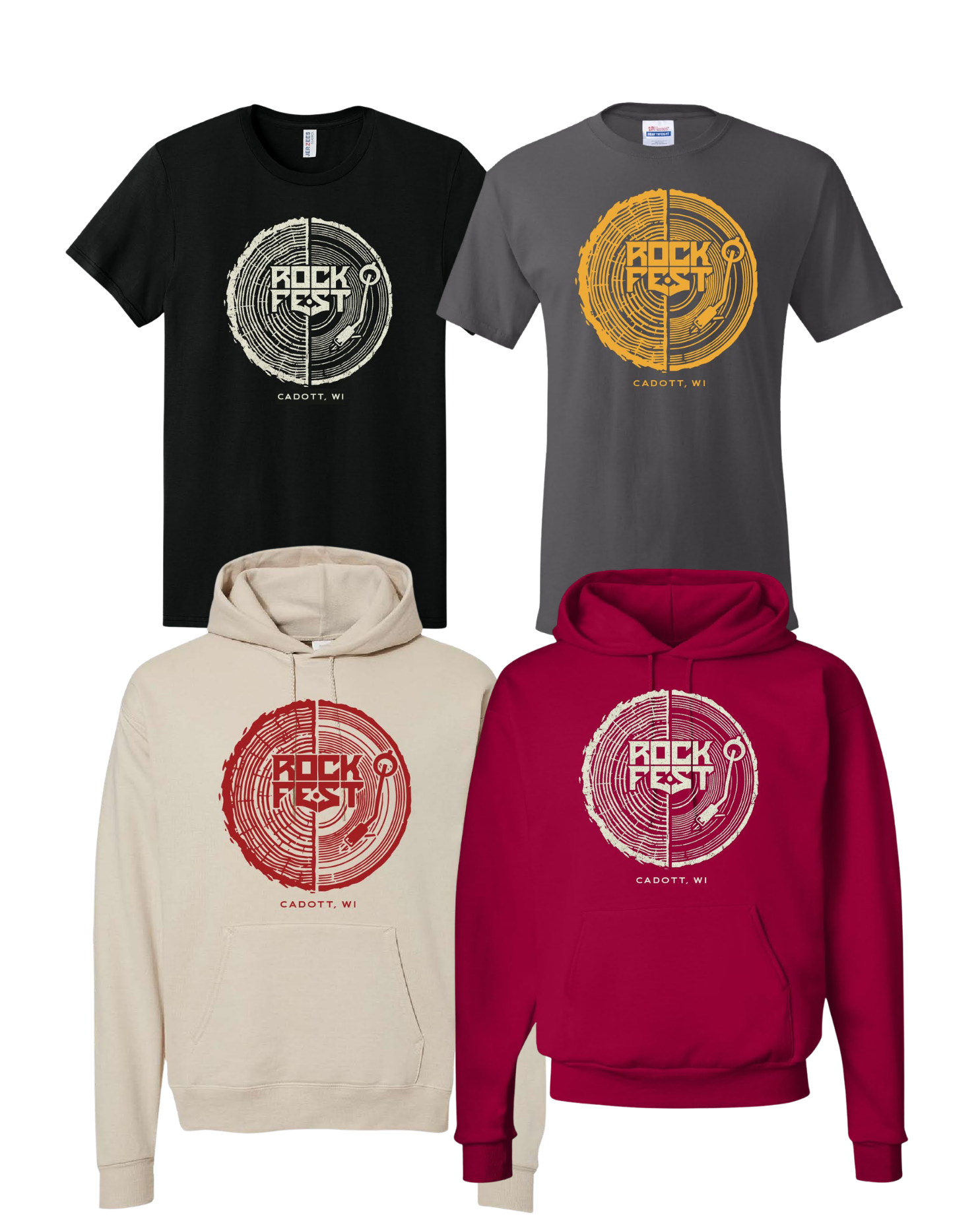
Record-Inspired Graphics
Adapted a music-inspired graphic across hoodies and tees while maintaining a consistent visual language.

My Role:
Apparel graphic design
Garment and colorway selection
Print placement planning
Illustration adaptation across product types
Production-ready artwork
Pantone/color considerations
Client approval mockups
Across the collection, I balanced bold festival branding with wearable retail pieces, creating designs that could serve different audiences, price points, and product categories.
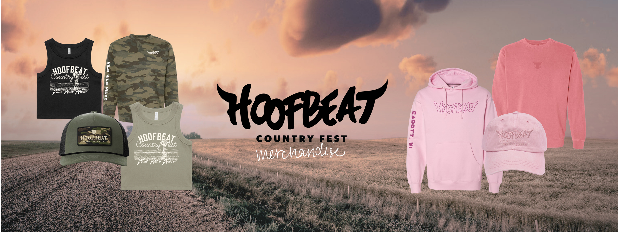

Hoofbeat
Western-Inspired Festival Merchandise
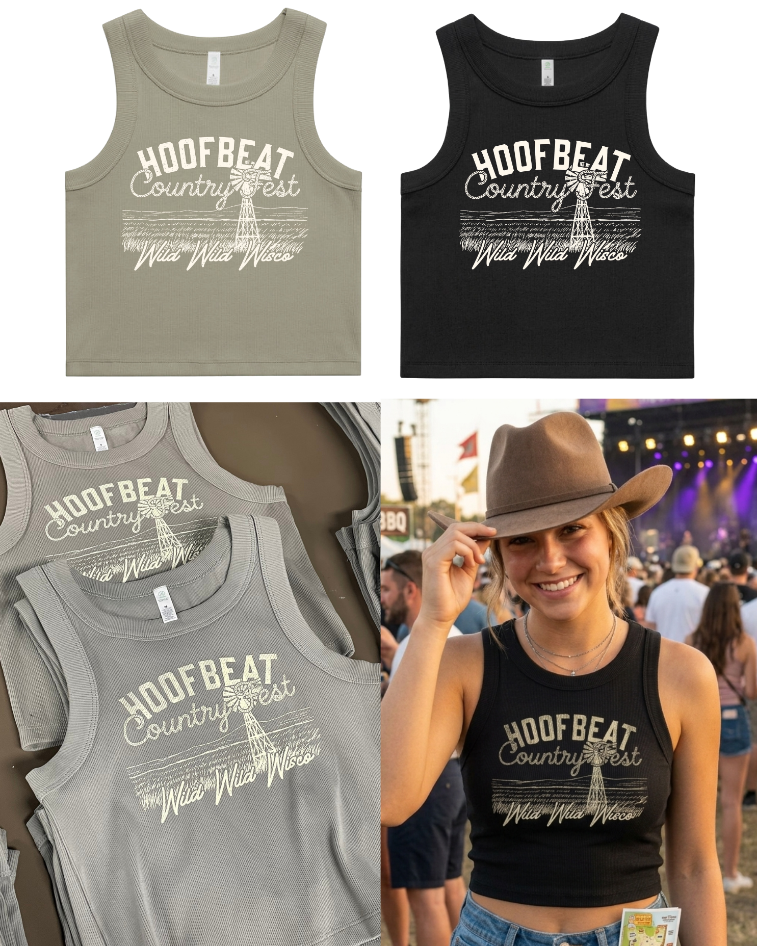
Statement tank designs combined bold collegiate lettering, script typography, windmill illustration, and textured linework to create a distinctly Wisconsin country festival feel.
Hoofbeat called for a softer, country-inspired approach within the broader festival merchandise project. I focused on wearable retail pieces, muted garment colors, western typography, rural iconography, and subtle logo placements that could appeal to festival-goers beyond the event weekend.
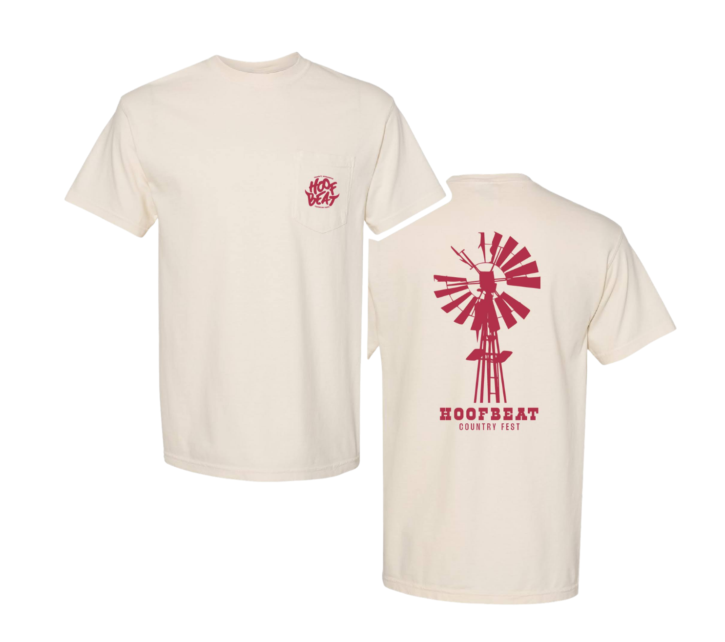
Windmill artwork and pocket-logo placement created a more classic festival tee option with a clean front and graphic back.

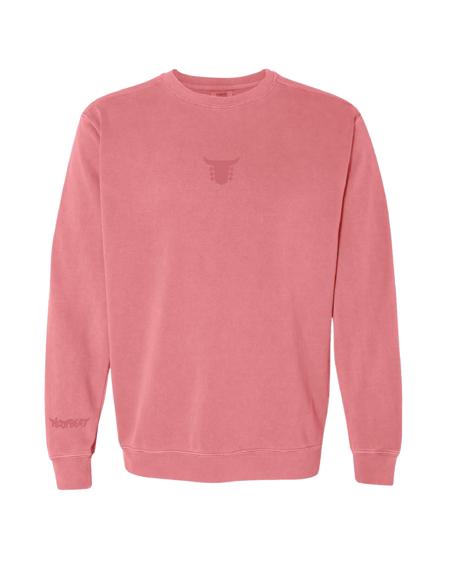

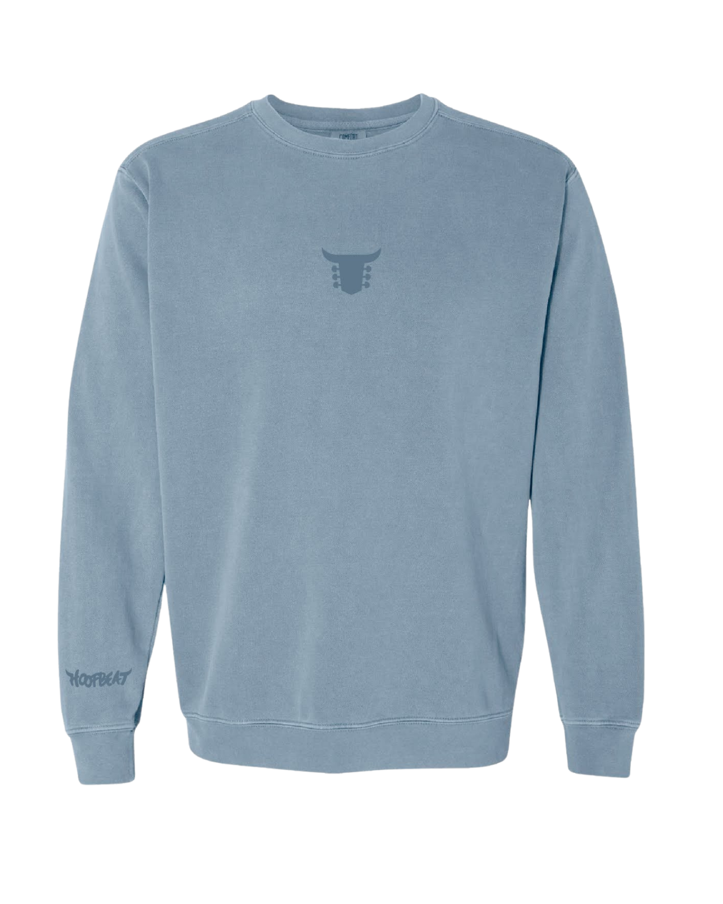
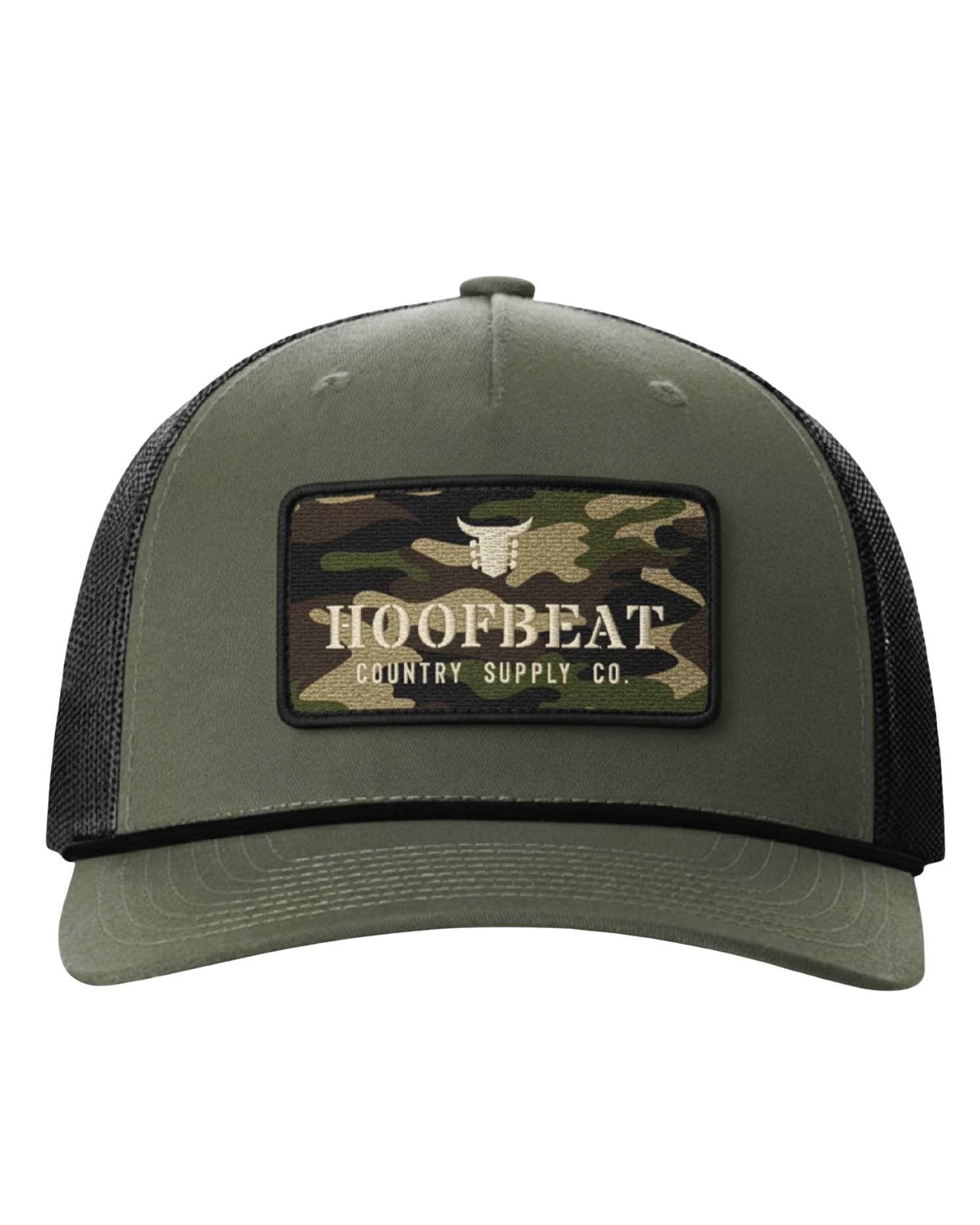
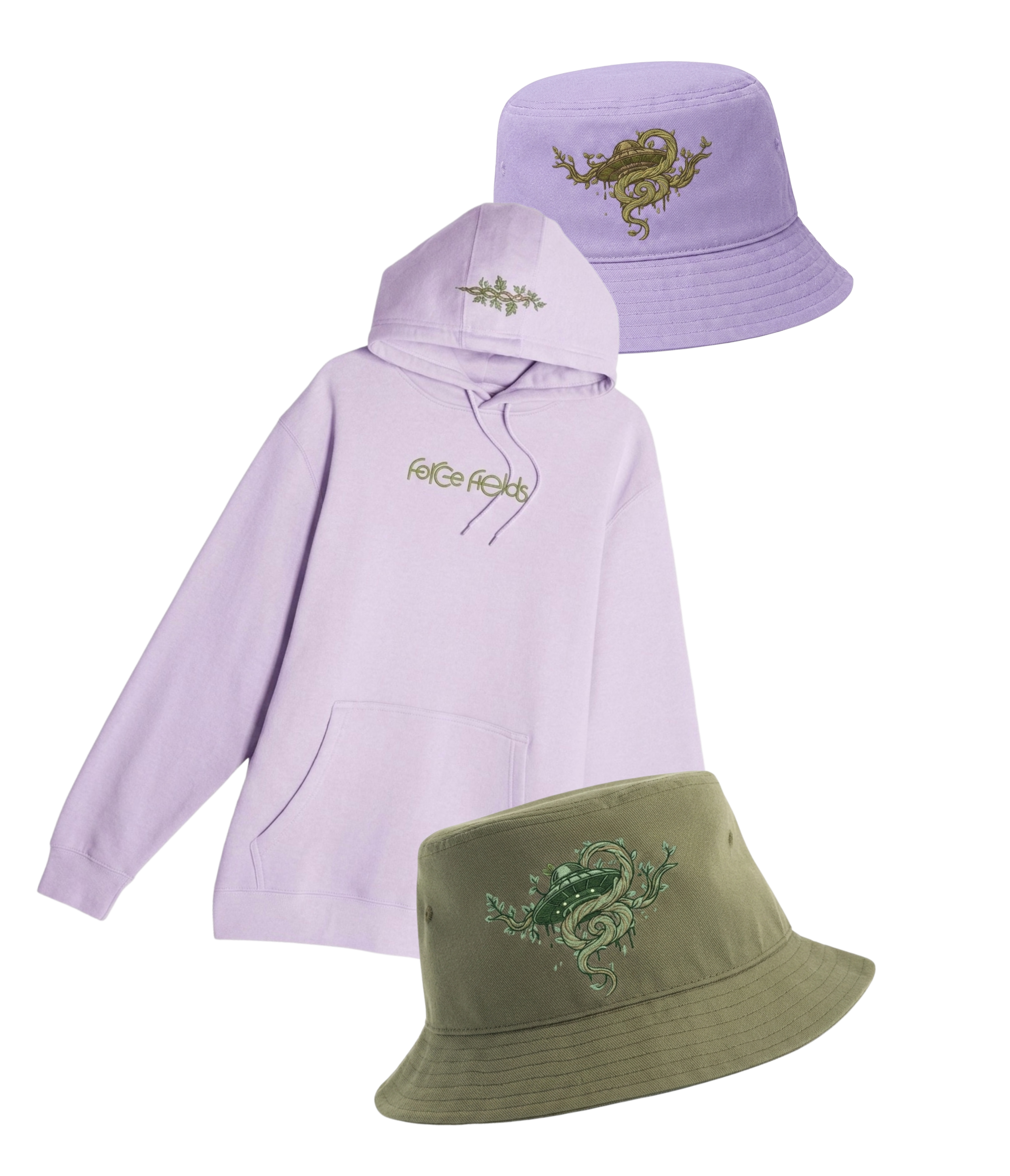
Minimal tone-on-tone graphics and embroidered accessories added softer, everyday-wear pieces to balance the bolder festival designs.

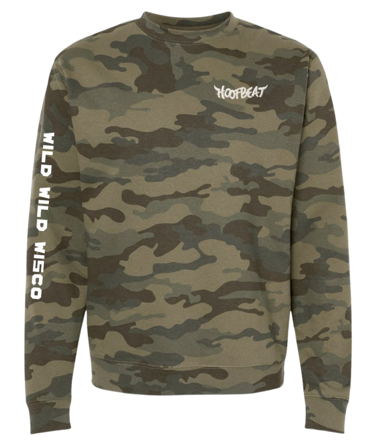
Sleeve graphics, chest logos, and alternate garment choices extended the collection across more casual, trend-driven apparel styles.
Camo garments help transcend the branding to be more unisex and lean into the Wisconsin audience.


Deliverables
Apparel
Accessories
Merchandise graphics
Product mockups
Production-ready artwork
The goal was to create merchandise that reflected the festival's identity while offering products attendees would genuinely want to wear and use after the event.
Force Fields
Electronic Dance Music Merchandise
Designed a merchandise collection for Force Fields EDM Festival, creating branded products that extended the festival experience beyond the event itself. The collection balanced brand consistency, audience appeal, and production requirements across apparel and accessories.

Designing for a Festival Audience
The goal was to create merchandise that felt authentic to the festival experience while remaining wearable beyond the event weekend. Product selections were guided by attendee preferences, current festival trends, and the established Force Fields brand identity.
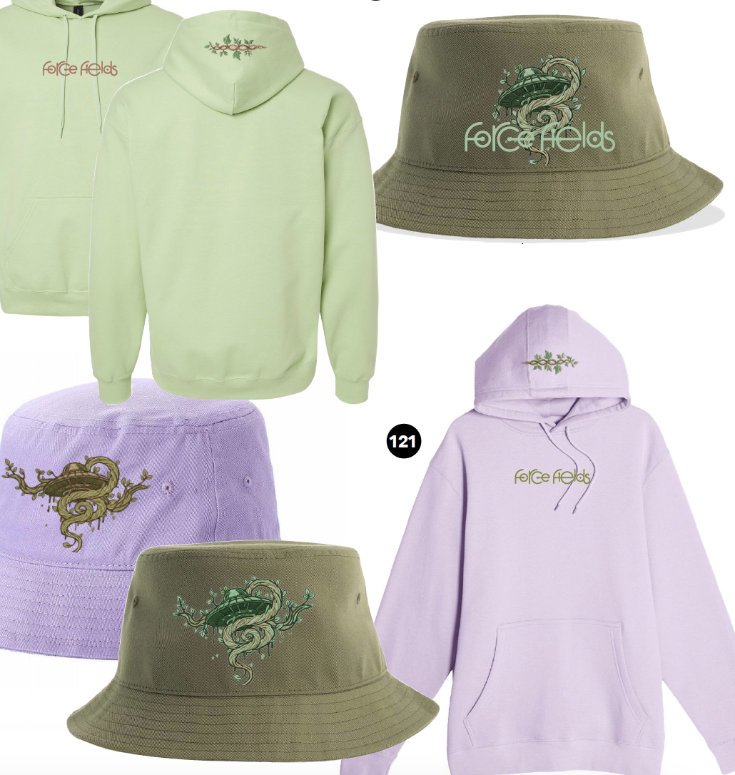
The collection included embroidered apparel, specialty headwear, tie-dye garments, and screen-printed merchandise designed specifically for the festival audience.
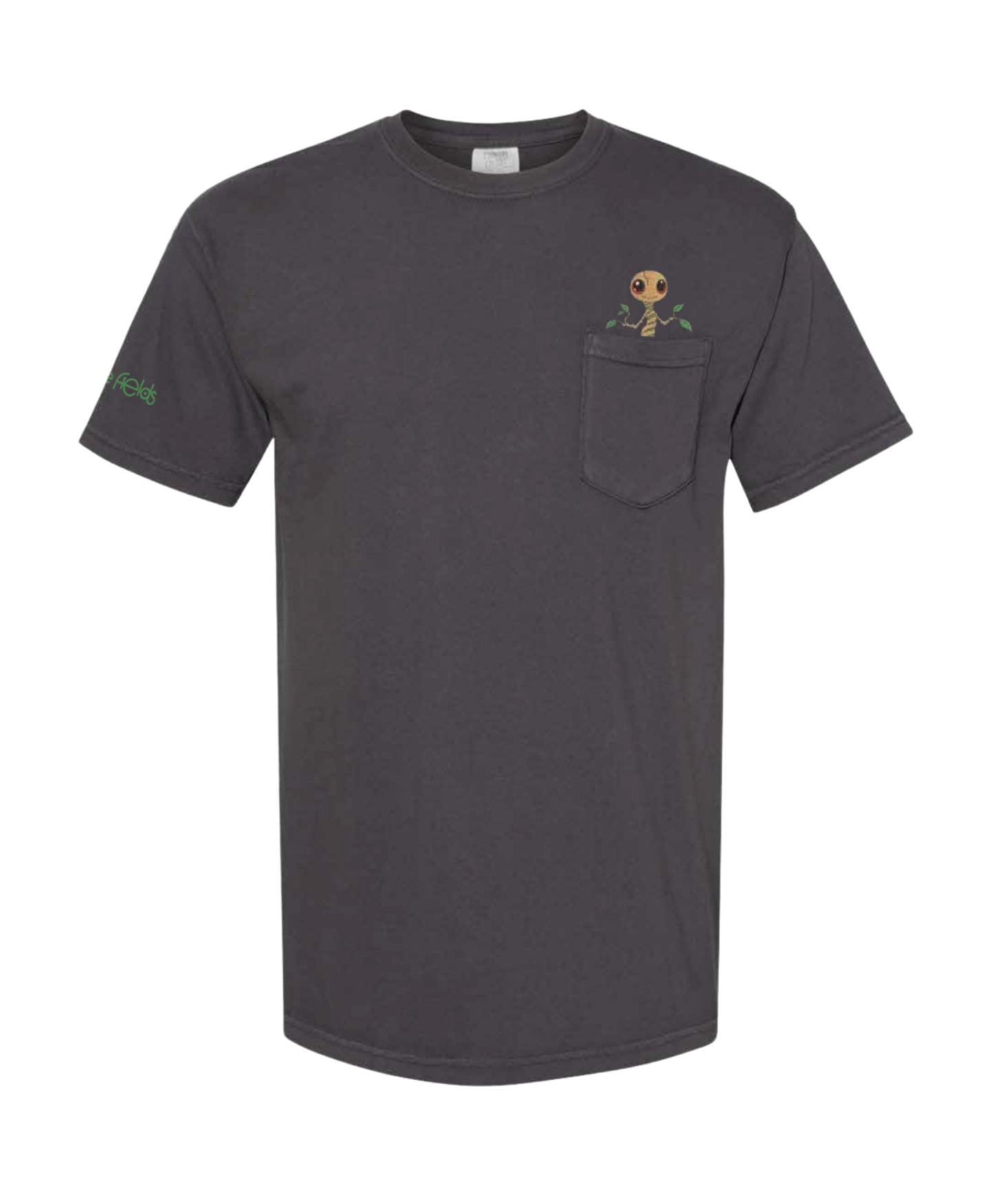
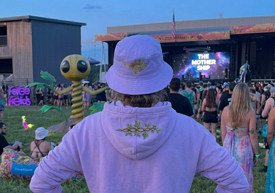
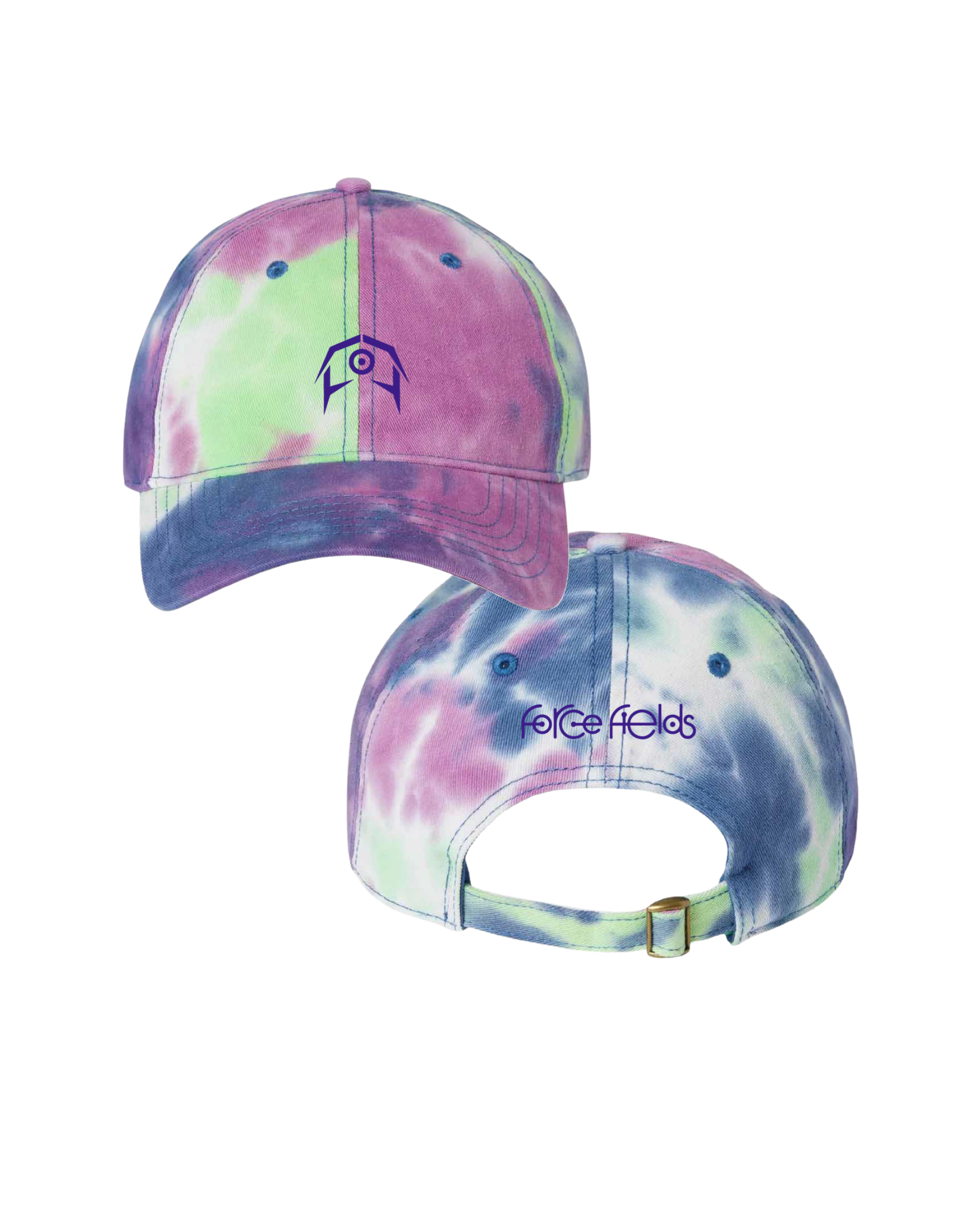
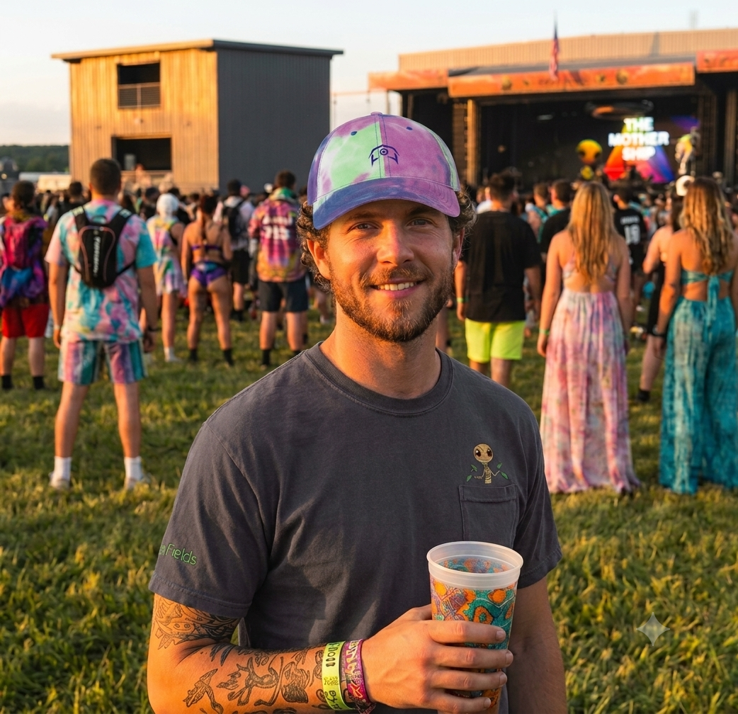
To create premium merchandise beyond standard screen-printed apparel, I developed a series of embroidered pieces for this collection. I selected a tie-dye cap that matched the festival's brand colors and applied simplified logo marks to the front and back. For the pocket tee, I incorporated the year's alien mascot into the garment itself, designing the embroidery to appear as though it was emerging from the pocket.
These pieces demonstrate my involvement in both product sourcing and merchandise design, from concept through production.
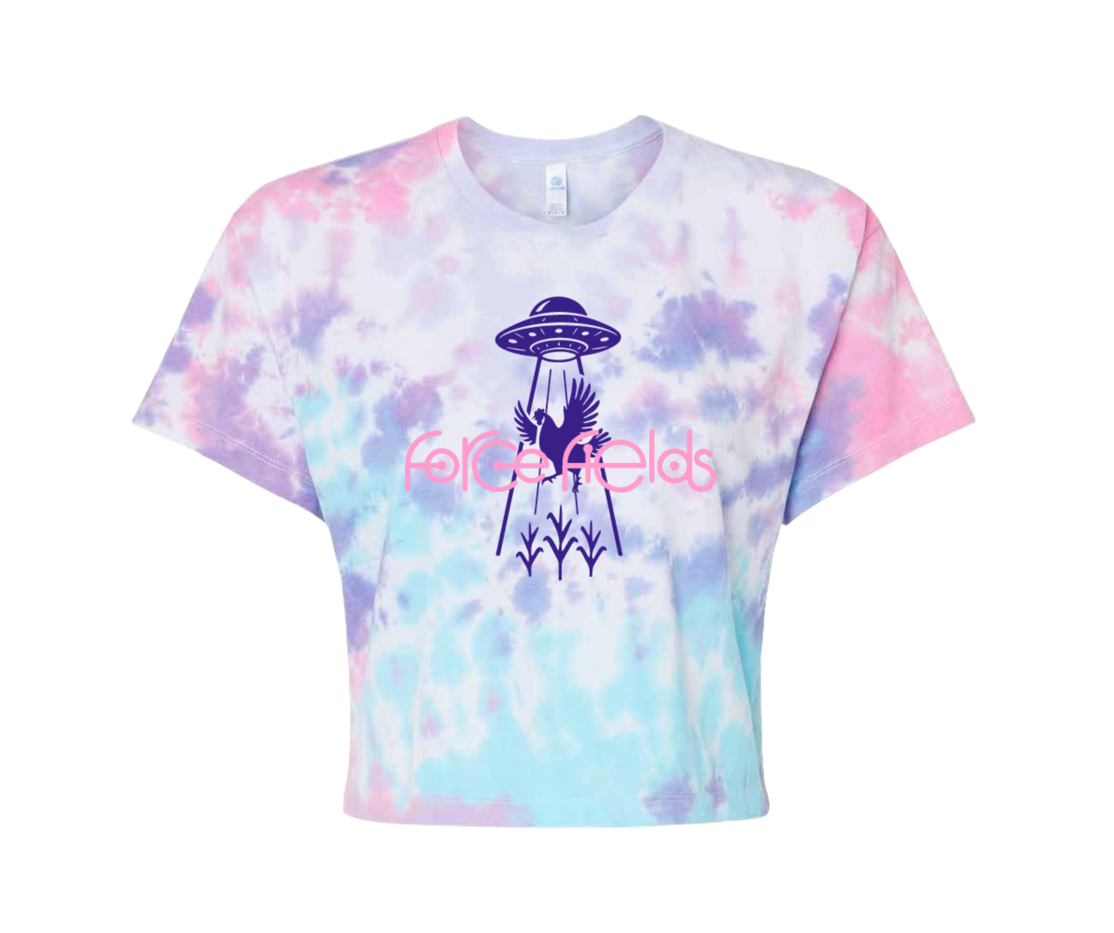
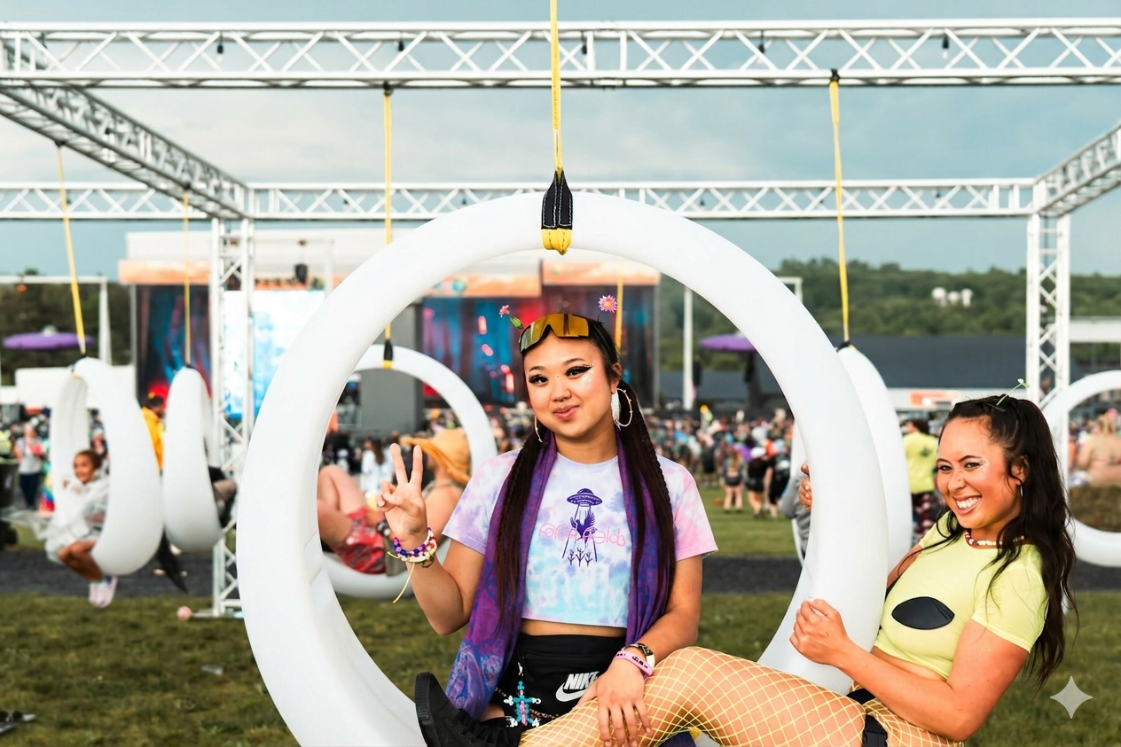
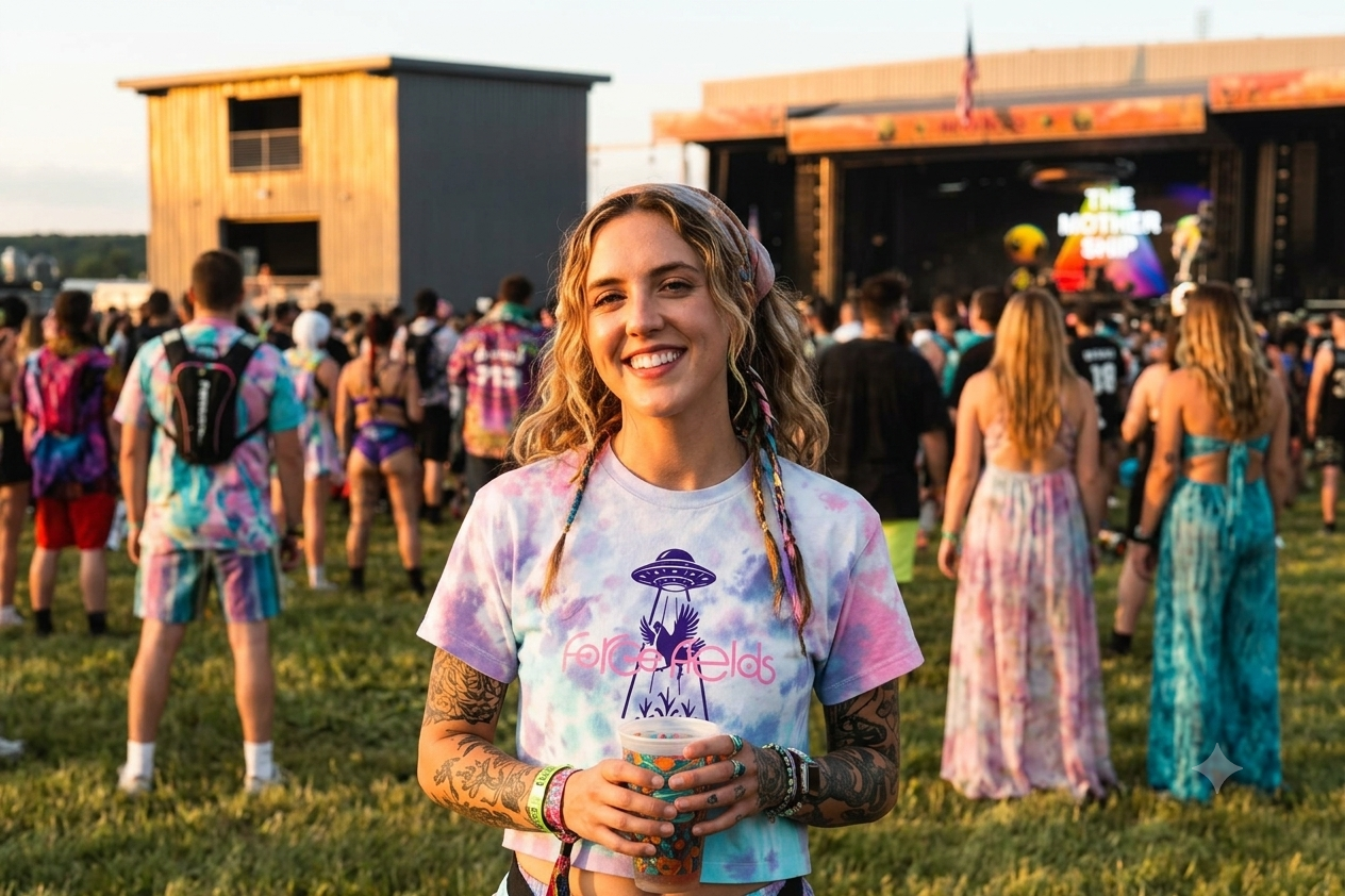
For this crop top, I selected a pastel tie-dye garment that aligned with both the festival branding and attendee style. The graphic was designed specifically for the blank, using the existing color variation as part of the overall composition rather than competing with it. This approach helped create a piece that felt authentic to the festival experience while remaining strongly tied to the event brand.